Is the design appropriate for the target audience? Who is the target audience?
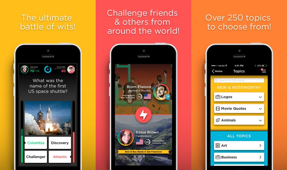
- Yes, the target audience is a wide-range of millennial’s and the app was sure to seamlessly use the user’s most defining images in a design-conscious way by having their Facebook Cover photo in the back with an appealing opacity/dark tint over it to unobtrusively highlight the profile photo and battle-information just before heading into a quiz with another user. Also, if the user hasn’t connected the account, they get matched up with a lovely animal animation…most millenials are suckers for cute animals, especially animated – smiling ones.
Does the content, organization, and navigation make sense for a mobile or touch context?
- Yes, better than most apps I’ve ever used. I feel like a lot of new apps build interfaces assuming the user now has some familiarity on where to go for things and what certain symbols mean and why they are there (i.e. the three-lined menu bar typically in the upper right corner of the UI)
- I love the metrics they provide…beautifully built out
What is working well? What could be improved and how would you improve it?
- This is an almost perfect app to me.
- I personally don’t like drop-shadows in apps and they use a lot of that
- I’d add in an integration with Venmo so you can actually bet your friends on games – perhaps QuizUp could take a cut of it : )
3 Design Lessons From The World’s Fastest Growing Quiz App
QUIZUP CHIEF DESIGNER SVEINN DAVIDSSON WALKS US THROUGH THE EVOLUTION OF AN APP THAT WENT FROM AN UGLY DUCKLING TO A $22 MILLION SUCCESS STORY.
Before QuizUp became one of the most popular iPhone services, it was a floundering series of one-off apps developed by startup Plain Vanilla Games under the name “Global Trivia Project.” The apps were a sort of Trivial Pursuit for your smartphone: There was a QuizUp app for basketball, for math, and so forth. But it wasn’t until the startup launched its Twilight app that the team knew it had struck a chord. “Players were just going insane–there was one guy in Italy who had 20,000 wins,” recalls chief design officer Sveinn Davidsson. “We realized then that people can get very crazy about trivia–and it actually guaranteed us most of our funding.”
Even then, the Twilight app featured many of the elements that makes QuizUp so popular today. Along with its ranking system and crowdsourced question database, the app featured one-on-one timed match-ups, allowing users to compete with each other in real time.
Since closing a $22 million series B round last week, the service–now a single platform covering increasingly niche trivia categories–has rocketed to more than five million users, who are eating up its games for an average of 30 minutes per day–a duration that roughly rivals Facebook mobile usage. That level of engagement didn’t come easy–nor quickly. The company spent more than a year undergoing countless iterations before it found the right design. Rarely do we get insight into that creative process–the mistakes and poor product decisions that are often covered up by rosy founder myths and even rosier press releases. But Davidsson recently shared with us how his team took QuizUp from paper to product–and the lessons they learned in the process.

Sometimes one size does fit all.
QuizUp began on a piece of paper. It was early 2012, and Plain Vanilla Games CEO Thor Fridriksson was scribbling ideas for a trivia app. One idea still stands out: QuizUp was all about vanity, a word Fridriksson underlined twice. It’s the emotion Plain Vanilla wanted to tap into–what Fridriksson calls “this very primal feeling inside [us] to let other people know that we know something,” which makes us yell out an answer when watchingJeopardy, even if alone. The company wanted to base the game on this emotion–to create a competitive experience designed around one-upmanship.
The startup initially decided to release one-off experiences based on specific topics–with separate apps for each category. It was an arduous development process but it turned out to be a blessing in disguise: It allowed Davidsson to test nearly two dozen designs with the public before releasing the QuizUp app that users know today. The first iteration, from April 2012 featured a generic and clunky interface. “You can see some pretty horrible UI here–everything looks out of proportion,” Davidsson says. “This was the first thing I created as a UI designer and it doesn’t look very good.” (Davidsson was previously a print designer.)

The next versions weren’t much better. In the months that followed, Davidsson experimented with branded and themed designs, such as a Nat Geo QuizUp app about animals and a video game QuizUp inspired by 1980s-era console systems. The eclectic approach helped the team nail down a basic underlying layout, but as Davidsson says, he was struggling to find the appropriate UI metaphors.
Eventually, Davidsson realized he was using the wrong textures. The “hyper skeuomorphic look” simply created too much visual noise. The QuizUp basketball app from January 2013, for example, featured a parquet court background and basketball-shaped buttons.
But the mistakes helped, and the design evolution actually informed the company’s business model. The startup learned in the process that more niche categories like the Twilight app received more engagement. They also realized creating one-off, topic-based apps was not sustainable–it took roughly a month to knock out a design, and the results were inconsistent and ephemeral at best. “We just starting realizing the potential of a mother app–how popular that it could be if our Twilight app was this popular,” Davidsson recalls. “We could use the mother app to introduce [users] to whatever [topics] they wanted.”

Simplify.
The next step: less is more. QuizUp nixed the skeuomorphic design, replacing it with a cleaner, stripped-down interface. “Every time I design a logo, there’s a version of it which is just black, and that’s where I start when designing,” Davidsson says. “It forces you to think about shapes, and when you reduce it this much, the bad things in the UI become much more visible.” So he designed the experience in black and white.
This effort to reduce the app to its core also improved the app’s speed and set the barrier to entry extremely low. The team wanted users to be able to play instantly. That might seem like an obvious feature but few competing trivia apps offered seamless access to their gaming experience. “Our magic is focused on it being as simple to play as possible,” Davidsson says. “Almost every other trivia app I’ve tried, when I’m trying to play against someone, I can’t even play. I have to send them a request, and then I have to wait for them to reply, and then I have to wait for them to play a round. It takes way too long and is way too complicated.”
Don’t chase trends.
By April 2013, the team had found a coherent design and began polishing it. But then Apple unveiled iOS 7 and suddenly, Davidsson recalls, “The look we had been working on just felt completely dated.”
The QuizUp app swung in the opposite direction. Dark colors were replaced with light shades; gradients disappeared; and drop shadows were reduced. Like most apps adopting Jony Ive’s iOS 7 palette, QuizUp became white and devoid of much character.
Davidsson realized they had gone too far to fit in with the Apple experience. “When I started, I was following iOS 7 instead of doing my own designs,” he says. The team decided to add back its rainbow color scheme, embellish its drop shadows, and give the app more life. “I’m not just trying to follow everything in the iOS 7 design–and I’m not too worried about what everyone else thinks,” Davidsson explains.
When the company released the final version of the app in November, it immediately took off. Users and critics alike loved its simplicity, its speed, and its playful design. Just weeks after launch, Plain Vanilla raised a $2 million round, and then a whopping $22 million round only a month later, a sign of its tremendous growth.
But reviewing the designs that predated the current QuizUp experience, Davidsson can’t help but show surprise at the app’s success. “I really didn’t know what I was doing,” he laughs. “[Looking back] I’m like, ‘Oh crap, why did I decide to do it like this?'”
