Natively – Application Definition Statement

Application Definition Statement Example

  • Purpose: Connect brands to influencers on Instagram for social sponsorships.
  • Who it’s for:
  • How they’ll use it:
  • Core functionality:
  • Consolidated definition statement:
  • Features that fit the definition:
  • Example of features that don’t fit the definition or exceed the project scope:
  • Influencers who want to be paid for their engagement
  • Brands who want to reach a specific geographic fence, demographic, psychographic
  • Brands:
    • For a specific brand campaign
    • To find the right ambassadors for the brand
    • To collect metrics on a campaign
    • For marketing a product/service
  • Influencers:
    • To make money
    • To extend their personal brand
    • To find brands to match with
    • To build a good influencer rating
  • Provide brands in localized areas with access to social influencers
  • Platform for brands to partner with Instagram influencers
  • Social Scores
  • Geographic Fencing
  • Instagram integration
  • iBeacon Notifications
  • Other social network integrations:
    • Twitter, Facebook, YouTube, Pinterest, Soundcloud, Spotify, WhatsApp
  • Co-branding…Brand to brand matching
  • Larger Sponsorships:
    • Allowing brands to build out a sponsorship need and crowd-fund from small brands in a specific area


App Critique 4: ZOHO Invoice

  • Is the design appropriate for the target audience? Who is the target audience?
    • The target audience is freelancers
    • Yes it is appropriate; clean, simple, and serves its purpose
  • Does the content, organization, and navigation make sense for a mobile or touch context?
    • Content:
      • No content, simply a service for freelancers
    • Organization:
      • The app is very well organized:
        • Very user-centric design in the sense that you fill in information as you would on an excel or word invoice
        • You can save customers for future use, provide and calculate estimates, track expenses for a project, time your work done, provide reports, and of course build out actual PDF (and may I mention nice looking ones) from your information for a seamless email to your customer
    • Navigation:
      • Makes sense, menu icon in upper left or side swipe to see menu with Archive, Settings, other options
  • What is working well? What could be improved and how would you improve it?
    • I like the that you can build customer profiles and actually provide yourself with metrics on how much time is spent with each one, how much you’ve made from them, so on so forth
    • I think gamifying the app could be a really interesting next step:
      • Seeing how efficiently you can finish a project
      • Rewards for earning a certain amount of money within a given amount of time
    • Would also be cool if it could track when the money actually comes in…by integrating with PayPal or Venmo
    • Also, would be great if there was an auto follow-up on your invoice every X-days
  • Any additional thoughts about the navigation, user flow, visual design?
    • No

3 Personas – Natively

3 Personas

Brittany Clemens

Age:  25

City:  Los Angeles

Job Title: Stylist

Annual Salary:  $30-50k

Mobile Device:  iPhone

Technical Comfort:  Medium-High

Favorite Apps/Sites:  Instagram, Facebook, Twitter, Pinterest


Introduction:

Brittany is a tastemaker and stylist with a massive social following.  She styles models and posts pictures to her social networks constantly.

Interests:

Clothing, brands, style, events, scenes, partying, social networks

Scenarios:

  • How’d they find it?
    • She found out through a friend that she could get paid for posting images of a certain brands clothing.
  • What did they do when they found it?
    • They looked at the app and read reviews  > downloaded the app  > made a profile
  • What were they doing before they found it?

    • Looking at photos on Instagram

Michael Franklin

Age:  31

City:  Los Angeles

Job Title:  Marketing Executive

Annual Salary:  $80-100k

Mobile Device:  iPhone and Android

Technical Comfort:  High

Favorite Apps/Sites:  Ad Age, Mashable. Flipboard, Adweek, Business Insider, Instagram, Facebook, Twitter, Pinterest

Introduction:

Michael is the marketing executive for a new beer company out of Venice Beach, CA.  They’ve just secured some distribution in local markets and convenience stores and now need locals to learn about and of course go buy their product.  He is looking for effective ways to reach the brands target demo.

Interests:

Marketing, Digital Marketing, Social Media, Branding, Startups, Beer, Beverages

Scenarios:

  • How’d they find it?
    • We approached Michael and pitched the platform/product.
  • What did they do when they found it?
    • He downloaded the app and watched our video tutorial.
  • What were they doing before they found it? 
    • Trying desperately to find cost effective ways to reach the brands demo in such a hard-to-reach digital age.


Greg Schaeffer

Age:  25

City:  Los Angeles

Job Title: EDM DJ

Annual Salary:  $100-150k

Mobile Device:  iPhone

Technical Comfort:  High

Favorite Apps/Sites:  Instagram, Facebook, Twitter, Mixmag, other EDM and music sites

Introduction:

Greg is a popular DJ with a massive social following and high engagement on all of his platforms.  Greg is looking for ways to make money on his posts by endorsing brands he identifies with.

Interests:

Music, DJing, Festivals, Partying, Girls, Social Networks

Scenarios:

  • How’d they find it?
    • Another DJ mentioned how much money he was making by simply taking photos with a brand and/or product.
  • What did they do when they found it?
    • They downloaded and made a profile…immediately got matched to brand that he identifies with.
  • What were they doing before they found it?
    • DJing

App Conceptualization – Natively

Natively Logo

What is the idea?

  • Native is a geo-targeted social sponsorship platform.
  • What is native advertising:
    • Native advertising is an online advertising method in which the advertiser attempts to gain attention by providing content in the context of the user’s experience. Native ad formats match both the form and the function of the user experience in which it is placed. The advertiser’s intent is to make the paid advertising feel less intrusive and thus increase the likelihood users will click on it.

What is our role?

  • Solely an app and platform for brands and people to use?
  • Marketing company conceptualizing partnerships and creating campaigns for small brand clients?
  • Both?

For who?

  • For the Brands:
    • “Leverage taste-makers that identify with your brand”
      • Build brand awareness in specific locations through small-scale social partnerships with taste-makers
  • For the People:
    • “Leverage your personal brand by identifying with others”
      • Make money and enjoy freebies by leveraging your following without skewing from your interests
      • Get sponsored

How?

  • App
  • Website
  • For Brands:
    • Reach targeted areas and demographics through product placement, hashtag promotions, endorsements, sponsorships, partnerships,etc.
      • Do it on your own
      • Do it yourself
    • UI for Brand Profile:
      • Specify key “tag” words to describe business (i.e. socially responsible, party, music, exercise, beverage, food)
      • Mission Statement
      • Location
      • Images (i.e. product, logo, etc.)
    • UI Process for Campaign:
      • Campaign statement (i.e. “This campaign is looking to increase brand awareness and following by generating X amount of activity on _____.”)
      • Opportunity/Request (per network);
        • Instagram:  Post photo w/ product and #JoeShmoeEnergyDrinks and/or @JoeShmoeEnergyDrinks
        • Vine/Instagram Video:  Same as above
        • YouTube, Twitter, so on so forth
      • Enter geographic fence(s)
      • Enter demographic specifications (i.e. M/F, Age, etc.)
      • Enter min/max level of engagement (i.e. must have approx 10,000 Instagram followers)
      • Click: Find Ambassador’s (what she we call them???)
      • …MATCHING…
      • See list of taste-makers that identity w/ your brand
        • List includes photo of potential ambassador and icons for each network/how many followers per
      • Tap preferred ambassadors
      • Tap networks to activate through (all or maybe just Instagram)
      • Enter compensation/bid for endorsement
        • Per type of post (i.e. video receives more compensation?)
        • Per reach
        • Bonus for level of engagement??? YES
        • Allow for freebies???  Partner with Amazon Prime or something so people can be sent freebies super streamlined???
      • Option to message potential ambassador
      • Notified if deal is accepted or counter is made
      • Deal(s) accepted
      • Posts made within certain time-frame
      • RATINGS
      • Brand is able to view posts in app/site through hashtag use
      • Ambassador is paid through Venmo/PayPal or whatever we end up using
  • Competitive Analysis:
    • Similar Apps:
      • Branded
        • They connect brands to influencers but the platform is terrible and the app is terrible looking with terrible UI, UX.
      • Klout for Business
        • Just announced not too long ago.  They are matching people with high Klout scores to big brands.  I haven’t been able to see the platform.

Native - Cover Native - Slide 2

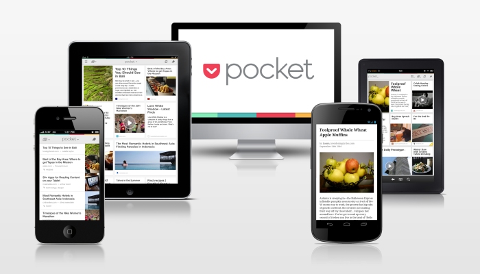
App Critique 3: Pocket

  • Is the design appropriate for the target audience? Who is the target audience?
    • The target audience is essentially anyone who is an avid reader or wants to save favorite articles for later/offline reading/viewing.  Likely professional young-adults to adults will be using tis.  From a design perspective I think it definitely matches the demographic; minimal, lots of friendly gesture demand – and you can also change the color of the background according to your viewing preference (white/black, specia/white, black/white)…love that feature.
  • Does the content, organization, and navigation make sense for a mobile or touch context?
    • Content:
      • Yes, you choose the content by saving an article to pocket using either an extension on your chosen browser (I use Chrome and it integrates seamlessly) or saving it to pocket through your apps (Flipboard allows you to save articles to Pocket for later offline viewing).
    • Organization:
      • The app is very well organized.
        • You can see the featured image of the article you saved in either square side by side images or in list view, you are given those two options.
        • You can tag the article you save with meta words so you can browse them more easily when opening Pocket.
        • Like I mentioned.  You can choose the color scheme in which you would like to view the article.
    • Navigation:
      • Makes sense, menu icon in upper left or side swipe to see menu with Archive, Settings, Images options
  • What is working well? What could be improved and how would you improve it?
    • I like the option to change color schemes, I mean, that’s not even something you can do with your browser.  If Black background is easier on your eyes…save the article to Pocket and view it in your preferred scheme.
    • I think it would be cool to see similar articles to the one you saved to Pocket.
  • Any additional thoughts about the navigation, user flow, visual design?
    • No

Pocket-Device-Lineup

App Critique 2: Mailbox

  • Is the design appropriate for the target audience? Who is the target audience?
    • The target audience is essentially anyone 17+, however likely only 17-45 year olds are going to go out of their way to find a better user experience for their email system.  From a design perspective I think it definitely matches the demographic; minimal, lots of friendly gesture demand – both large and small swipe each way, etc.
  • Does the content, organization, and navigation make sense for a mobile or touch context?
    • Content:
      • Yes, the content is email which has long-been a mobile mainstay
    • Organization:
      • The app is very well organized.
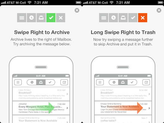
        • You can large swipe to the left to apply your emails to a specific list (i.e. buy, to-do, entertainment, a Groupon)
        • You can short swipe to the left to set a specific time the email will come back into your main inbox should you not need to address it then and there, which is the case with many emails (i.e. A client replied “let’s catch up early next week” and I swiped and set it to come back in my inbox early next week…I LOVE this feature; procrastination at it’s best!
        • On top of all this gesture and organizational greatness, the main intent of the email app is to get your inbox down to zero (which is not an easy thing to do, but the app makes it easy):
          • You can mass archive emails and set reminders on the others or put them on lists, and when you get to zero you are rewarded (and can even share that you got down to zero)
    • Navigation:
      • Makes perfect sense:
        • Middle Header Icon = Primary Inbox
        • Left Header Icon = Deferred/Reminders
        • Right Header Icon = Already Checked
      • Long swipe left or upper left menu icon goes to full menu with settings, lists, etc…very intuitive
  • What is working well? What could be improved and how would you improve it?
    • The long and short swipes each way.  However there are times where it is off on the sensitivity…I have deleted emails when I meant to simply mark them as read.  I would simply adjust how far you have to large swipe to perform that action.
  • Any additional thoughts about the navigation, user flow, visual design?


mailbox-app-actions-1